
Building the Bank that Actually Helps
Varo Money is the bank that actually helps, with features including fee-free checking, high yield savings, no-fee overdraft and more. We have received approval for a national bank charter and are on our way to launching the first mobile-only national bank. But first, we have to build the bank from the ground up. After spending a few weeks reimagining the Varo brand, I lead end-to-end design of the new bank, rethinking the information architecture to delivering high-fidelity designs for the accounts experience.

TL;DR
Problem
We’ve gathered some learnings from our flagship product, Varo Money, to understand our current pain points:
Customers are confused about our product offering. They often confuse us for an account aggregator or a personal finance management tool, before they recognize us as a bank.
Customers are primarily checking in to view their account balances and recent transactions but our current UX does not optimize for these primary user needs.
According to customer satisfaction surveys, design is among the top 3 reasons why we lose customers.
In order to address these pain points while building a solid foundation the new bank, we must first streamline the basic banking experience. This means removing underutilized features, redesigning the accounts experience to be bank first, and revamping our design system to a more clean and modern aesthetic that separates us from traditional banking.
Goals
Help customers understand that we are a bank first.
Create a solid basic banking experience that build trust with our customers.
Improve user retention with a cleaner and more modern design interface.
Measure the impact of removing external accounts from the home screen.
Solution
We introduced the Insights feature as a new value prop for our core product that lives in its own tab and that is also integrated into the training experience. Premium users are able to unlock personalized Insight reports by playing games. These reports are stored in the Insights tab for easy access. We used the hook model to build a content delivery system that helps increase engagement in two ways:
Cadence: We are delivering a steady cadence of novel, engaging content for our Premium users. Each new report release re-engages users.
Habit Formation: We are incentivizing users to train regularly by rewarding them with unlock-able personalized reports that gets richer the more they train.
My Role
I was the lead designer working closely with a product manager, a junior designer, and several engineering leads across all platforms. My core responsibilities included but were not limited to:
Information architecture
Task flows
Wireframing
Prototyping
Visual/UI design
Responsive design
Motion design
Design systems
Research
We dove into some of our past user research, user feedback, and customer support emails to get a better understanding of user needs.
User Desires and Needs
Users want to feel that they are progressing in some measurable way using Lumosity
Users want variety and novelty in their Lumosity experience
Users desire a deeper understanding of themselves
Users need more substance to Lumosity than just games to keep them interested
Ideation
Based on user research, and the existing patterns we’ve already discovered in our data, we already had quite a few ideas of data Insights we could deliver. But we also needed to take a step back to figure out how and to whom might we deliver this content. We needed to decide what we were building. As at team, we put our heads together to brainstorm around several prompts.
Prompt 1: Going Broad
How might we use data Insights to create value for our users?
For this initial prompt, we went broad to generate as many ideas as possible, breaking pattern entertainment and ignoring constraints.
We noticed patterns in the ideas that we came up with. We talked about the content and value we’d deliver (i.e. performance reports, gameplay analysis, aggregate data vs. personalized data etc).
We considered how the content could integrate into the product: integrated into our workout model or as a permanent feature that lives in its own tab.
We also had questions around if and how this feature would differ from our existing stats page.
Prompt 2: Definition
How do we define an Insight?
To avoid any confusion, I sought to get clarity on how we distinguished between a stat vs. an Insight.
An Insight IS a feature that exposes and analyzes or interprets data for a user.
An Insight IS NOT “anything with data.”
An Insight should be any combination of the following:
Engaging - Primary goal. Improves engagement and renewal metrics.
Personalized - Shares knowledge relevant to each user
Expert - Provides trustworthy information that users can’t get elsewhere
Actionable - Helps a user progress toward his or her brain health goals
Integrated - Supports other parts of our business (e.g. tests areas of user interest; collects data for new initiatives; directs users to new features)
Shareable - Improves public view of Lumosity’s role in cognitive research/knowledge
Prompt 3: Delivery
How might we deliver Insights?
We discovered many ways and considerations for delivering insights:
Frequency: One time vs. every day/week/month
Location: Integrated into workouts vs. standalone
Permanence: Stored content vs. transient
Variability: Unexpected vs. routine
We could augment our current engagement loop (workout and games) or create a new type of engagement (separate Insights-only feature). Our strategy was to go with a combination of both to make this feature a very integral part of their brain training.
Prompt 4: Habit Formation
How might we use Insights to motivate users to train more regularly?
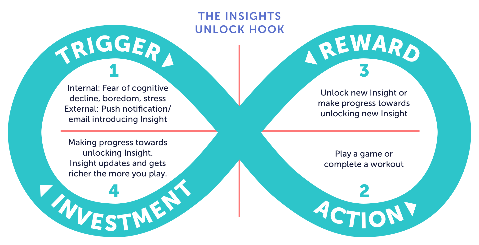
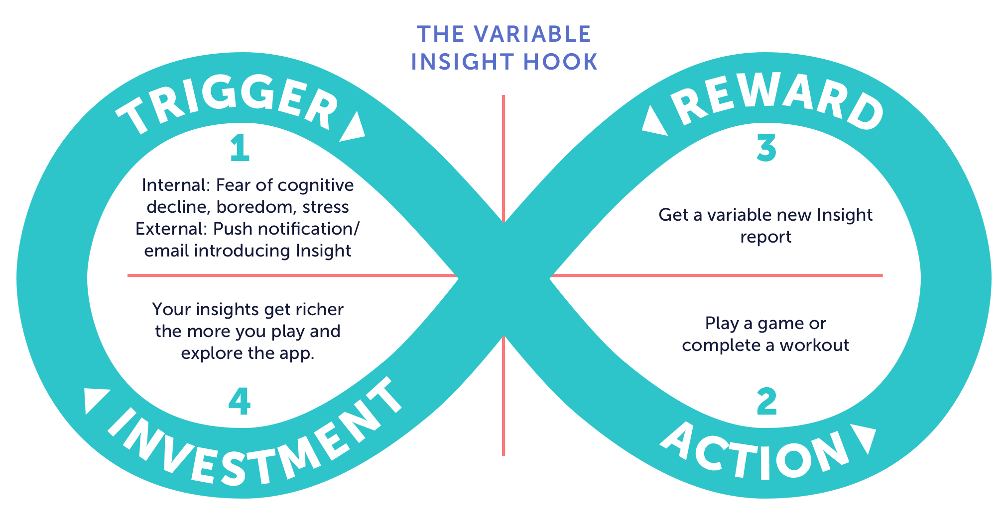
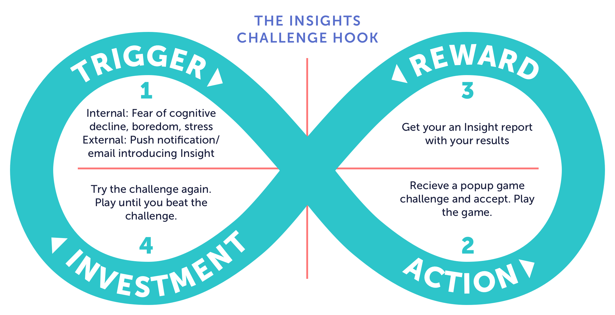
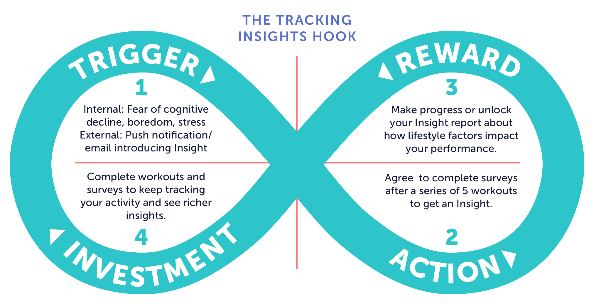
Now that we’ve gathered enough context on the problem we’re solving and what we could build, we can narrow in and begin thinking about execution and how we can meet our goal – engaging and motivating our users to continue training. To effectively brainstorm around this prompt, we leaned into habit forming UX framework, the hook model by Nir Eyal.
This framework requires 4 parts – trigger, action, reward, and investment – and these must cycle with enough frequency to form a habit.
We had a ton of ideas. Here were some of our favorites:
Task flows
After brainstorming and thinking through these prompts, we had enough information to put together some initial task flows to get a better look at how this feature could fit into our existing workout model. This went through several iterations after testing different concepts and prototypes but this is where we landed in the end:
Prototyping & testing
INtegrating Insights into the Training experience
In the next phase, we began prototyping, testing, iterating on our ideas. At this point in the process, in order to work more efficiently, the UX designer and I chose to divide and conquer. She explored how Insights would be integrated into the training experience and took a first stab at what Insight content could look like.
Creating aN Insights LIbrary for Stored Content
I focused on designing a library of new Insight content, living in it’s own tab that users can access any time.
I wireframed every content library pattern and layout I could dream up and selected the horizontal layout for several reasons:
Longer title lengths: we need to support multiple languages
Visual identity for each report: use unique styling to differentiate between reports
Design for richness: use visual imagery (icons, illustration, etc.) to make this feature exciting and feel more “Premium”
Design for breadth: show users that we have a growing library of content
FOMO: Create enough intrigue that will entice Free users to sign up
Consistency across platforms: follows conventions and guidelines that suit both iOS and Android.
Unlocking Insights
After soliciting feedback from the team, it was suggested that we may require a minimum amount of data from gameplays to deliver valuable personalized Insights. We took a “quest” approach using unlock criteria and showing progress, similar to popular games such as Clash of Clans. The unlocking of content creates a new engagement loop, which ties in nicely with the hook model.
Goals for the Insights Tab
Get users excited about working towards unlocking Insights
Give users a clear path and control of unlocking Insights
Give users a sense that they’re making progress towards multiple Insights
Design
Defining the MVP: The Insight tab
For MVP, we prioritized building the new Insights tab feature first including 3 Insight reports.
For the visual design, I focused on different ways to display cards, visualize progress, and create a fun and satisfying unlock experience.
Adding Motion to create anticipation and delight
We want to get users excited about unlocking Insights. In order to make the unlocking moment deeply rewarding and satisfying, I animated the transition using Keynote.
Closing The loop
It wasn’t til months later that we integrated the Insights feature into the core training loop. By then, we had already defined a new design language and component library. We designed a card component and the Insights page would eventually need to be overhauled to match the new design language. In the meantime, we used the new card component for the new Insights progress card we added to the post-game screen.

Final Designs

Outcomes
Insights are driving conversion, engagement, and retention. Renewal rates have shot up to the highest levels we've seen in at least 5 years.
Immediately following its first launch in 2017:
There was a 5% increase in daily actives for subscribers.
There was a 5.1% increase in game plays excluding Ebb and Flow.
There was a whopping 29.8% increase in Ebb and Flow game plays, presumably because Ebb and Flow is featured in an Insight report.
Other successes include:
Adding Insights to the purchase page value props improved new user web conversion rates by ~11%.
Each report release re-engages users, sustaining New Year lift.
Our users love Insights!
Lessons learned
We’ll need to keep experimenting with the unlock criteria to maximize engagement and retention.
At launch, we required high investment (10+ game plays) to unlock most Insights. We have tweaked those numbers which has improved metrics slightly. We are still experimenting to find that sweet spot between engagement and investment.
It’s important to design for scale from the start.
The initial design worked at launch but it’s become clunky and overly colorful as the Insights feature has scaled. Now we are at 11 reports and the page is in need of a major overhaul. Here is my proposed redesign, consistent with our newly implemented design language:
We still need to test different approaches to engage and convert free users.
Insights is a subscriber-only feature and free users know very little about Insights. We can show free users the value of Insights if we tease content and see if we can increase conversion in-app.