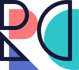
Fun with Letterforms + Geometry
I was working on a monogram logo for my portfolio when one thing led to another... and so I birthed the whole alphabet. I haven’t experimented with typography like this since college so this was a really fun exercise!
Readability
But does it pass the readability test? Let’s see it in context.
Fun with Colors
And just for kicks, here it is in a fun array of color palettes. Which is your favorite?


