Evolving the Lumosity Design Language
Lumosity’s design language is a component library and style guide which promotes rapid development, code reusability, and design consistency.
Overview
Problem
Lumosity experienced a lot of growth over the years. Our design organization consists of multiple functions and teams. We needed to establish a design language so that we could work at speed and ensure UI consistency.
Goal
Modernize Lumosity’s design language across all platforms and touch points without negatively impacting metrics.
My Role
To work through this challenge, we assembled a small group of 5 designers.
My core responsibilities included but were not limited to:
UI Audit
Usability testing
Interaction design
Visual/UI design
Responsive design
Style Guide
CSS
Our Design Process
UI Audit
We started by auditing the current design system. I led a series of UI audits and as a group, we identified components that were widely used across all of our touch points.
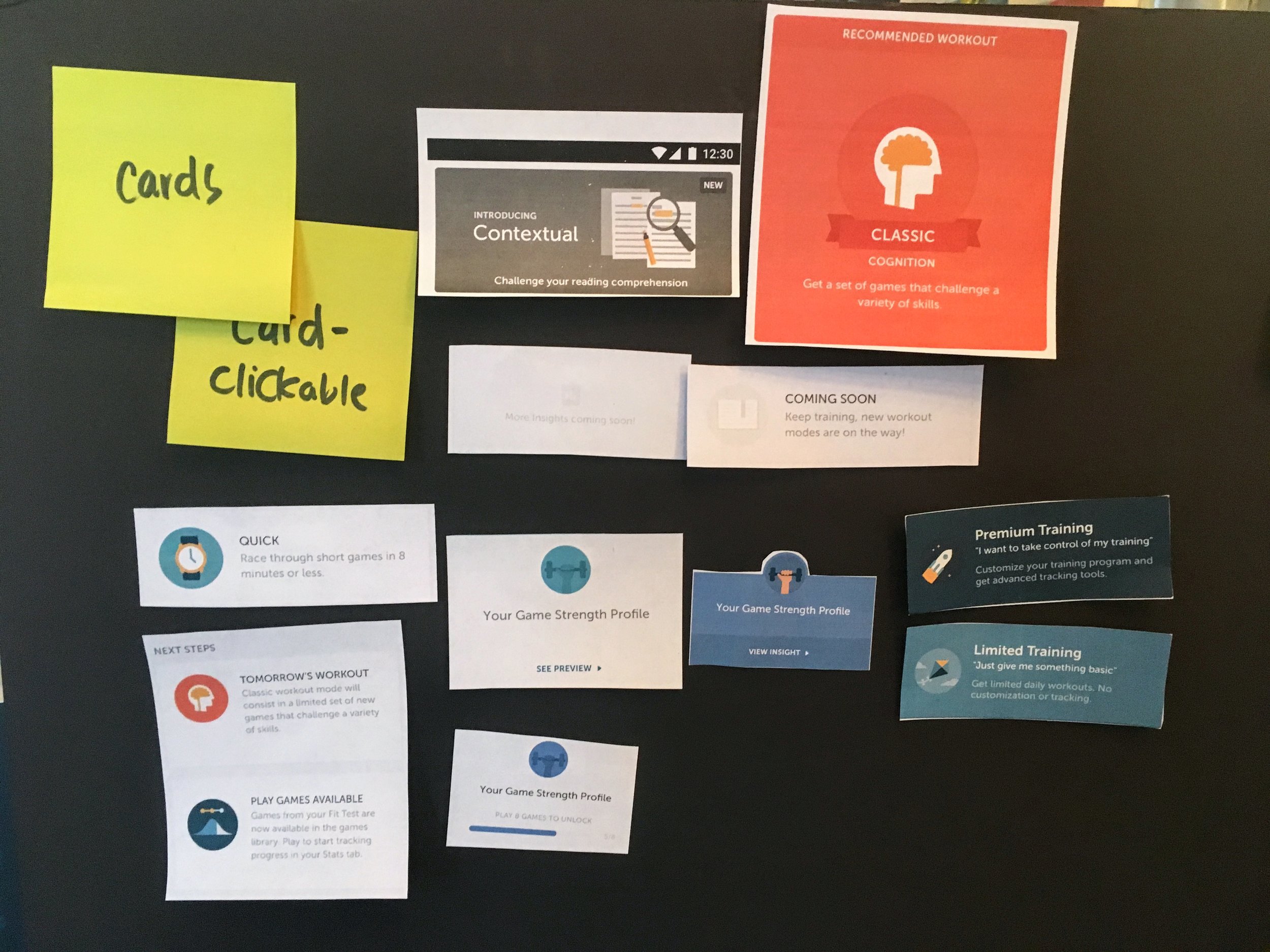
First, each team member was assigned a section, feature, platform, or product to print and organize. We laid out all the screens to identify how we might break down our components.
Then we took our scissors to cut apart the pages and organized the components. This helped us understand which components were most common, most visible and the most inconsistent.
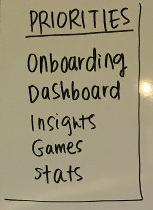
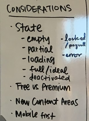
We then created a prioritized list based on the most common components as well as what was most relevant to the upcoming work in our roadmap. We listed out considerations such as states, platforms, etc. and reminded ourselves of our brand personality to keep top of mind as we consider the redesign.
Design
We focused on a one-to-one conversion of each of the design components. Each contributor selected a few components to redesign and provide documentation.
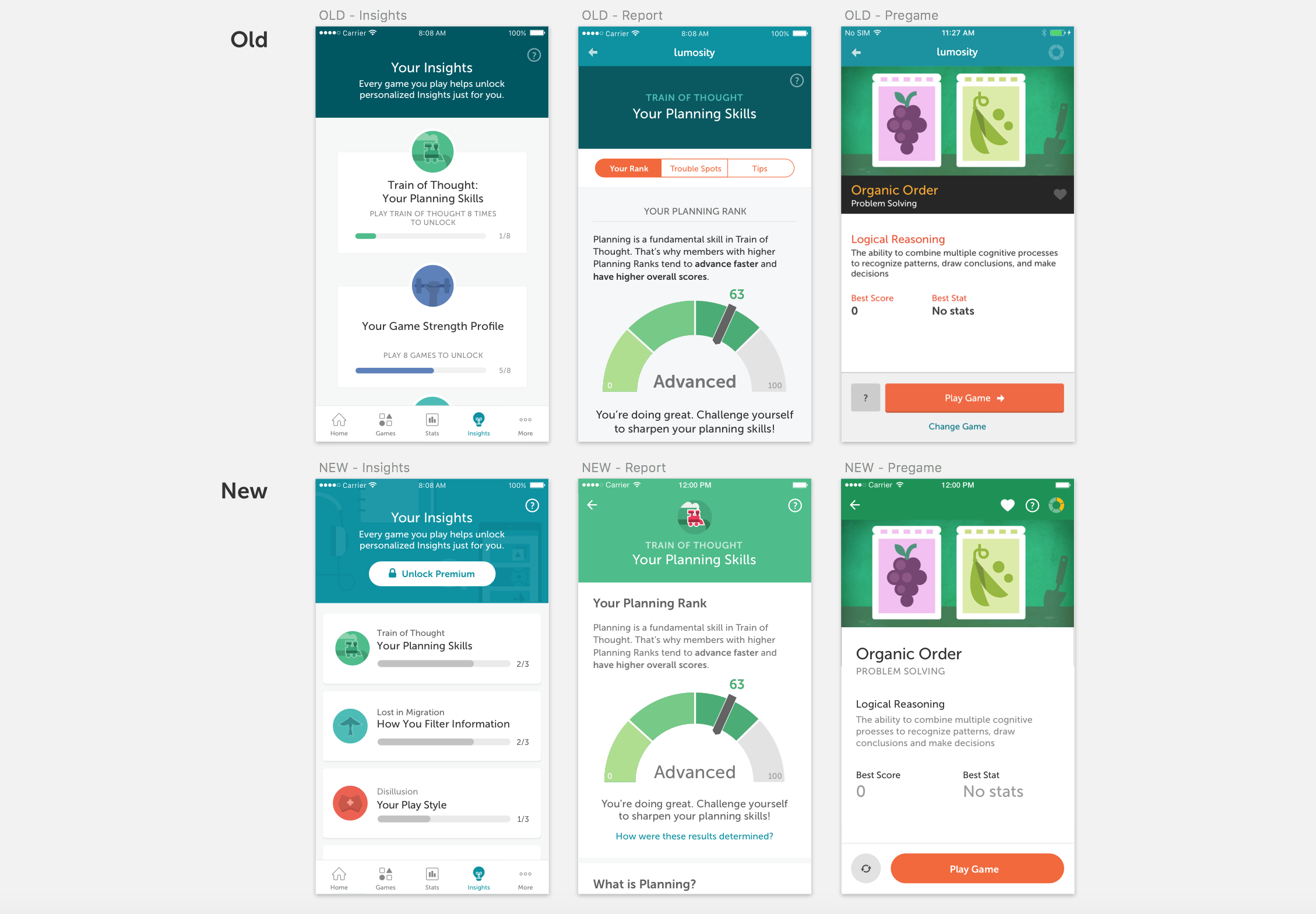
Finally, we mocked up the main user flows with restyled UI. We iterated on our respective components until all the pieces were unified and cohesive.
Usability Testing
We conducted component usability testing with approximately 8 users. Our goal of the sessions was to confirm the usability of the design language components. We wanted to know whether users had difficult interacting with the components due to the designs elements themselves (i.e. font size, color, shapes, etc.) and if they understand how to interact with the app with these newer components in place.
Testing the Dashboard Screen
Testing the Pre-Game Screen
We made revisions to our respective components as needed based on the feedback we received.
Implementation
We each partnered with engineers to refactor code for higher efficiency, and implement new components across all platforms including iOS, Android and web. I provided CSS styles to ensure components were implemented at the highest fidelity.
Ongoing Development and Documentation
Our design component library is contained within a living document in Sketch and Frontify that are shared across the design and engineering teams.
My Final Designs
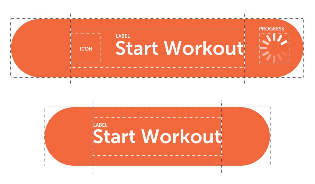
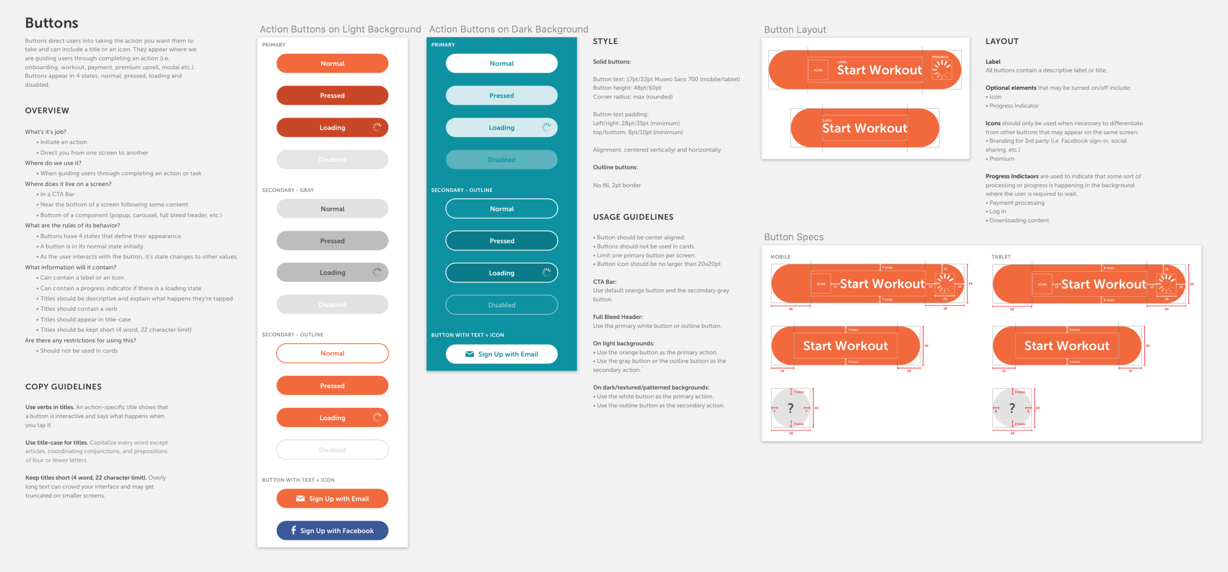
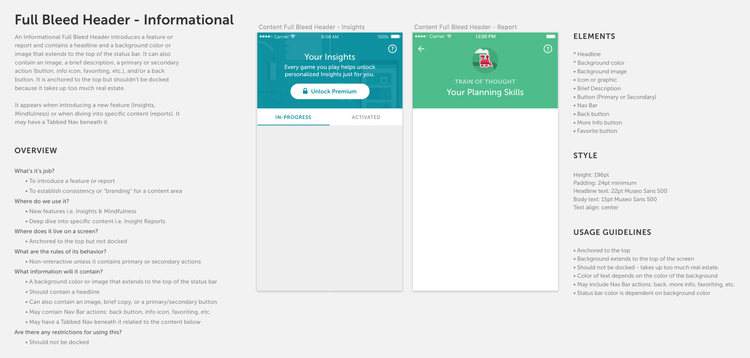
I focused on the core experience. Below are a few key components I defined including buttons, CTA bar, and full-bleed headers.
